rebranding city varieties
Background
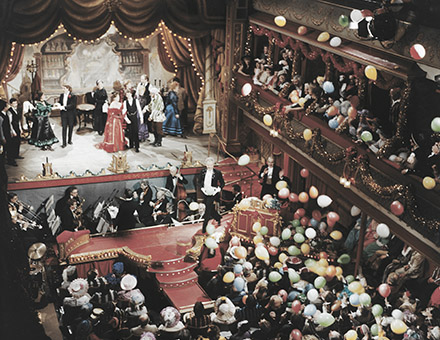
City Varieties Music Hall was built in 1865, in the heart of Leeds city centre and has survived virtually unchanged across three centuries. Many of the world’s greatest entertainers have trodden the boards there including, Charlie Chaplin, Buster Keaton, Harry Houdini, Lilly Langtry, Harry Lauder and Mickey Rooney. It has played a key role in the careers of the likes of Frankie Vaughan, Ken Dodd, Roy Hudd and Barry Cryer. For thirty years, City Varieties was home of BBC TV’s record breaking The Good Old Days, which first broadcast in 1953 and was screened around the world. City Varieties has established an unrivalled reputation for presenting the very best in live music, variety and comedy.
Recently, the Varieties has undergone a huge upgrade, including a complete demolition and reconstruction of the backstage areas, painstaking ceiling and plasterwork repairs, new carpeting and seating throughout the auditorium and major excavations to re-establish the ancient cellar network.
client details
City Varieties Music Hall
Swan Street, Leeds, LS1 6LW
0113 243 0808
cityvarieties.co.uk


The brief
To update the City Varieties brand identity. It should relate to the history of the venue but be timeless, not ‘trendy’.
Our approach
During initial consultation with the client we discussed the idea of using something based on one of the venue’s historical logos – something that may have been used on the old theatre posters from the Victorian era or mid-1900s. Thankfully, City Varieties have a large archive of these posters and we pursued some ideas based around this idea as well as looking at several other different options and approaches. We presented initial thoughts for consideration and the client selected a few of them for further development. We then went on to illustrate how these may work across various applications and looked at different colourways. City Varieties selected one and the identity was developed and applied across its internal and external communications.
The result
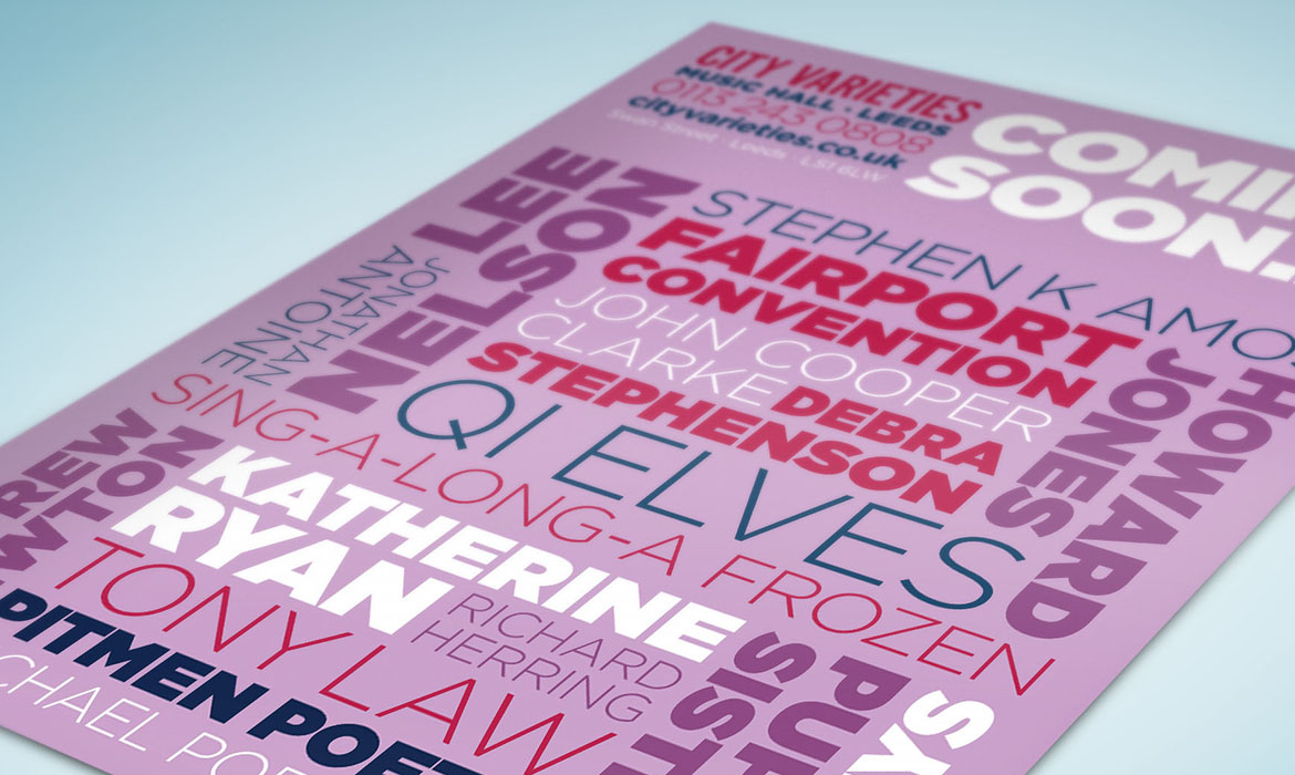
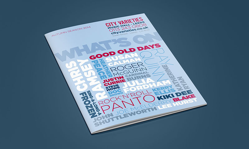
The resulting identity is a modern take on the old-style theatre billing posters. We created two versions of the logo, one that stands alone and one that includes booking details which can be applied to publicity material to maintain consistency across print.
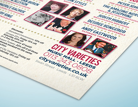
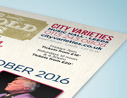
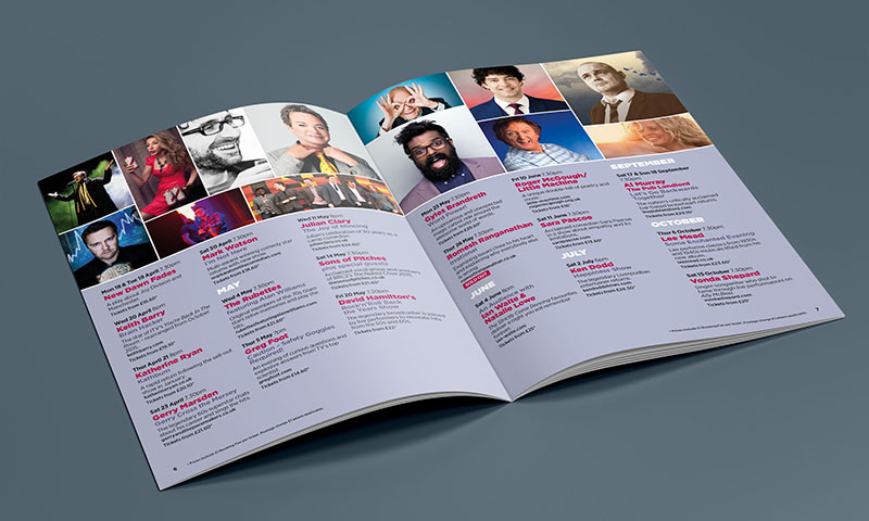
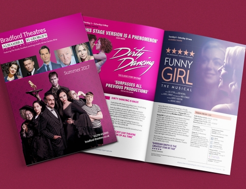
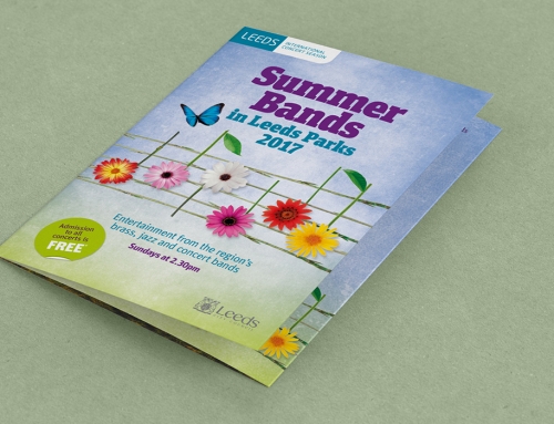
As part of the exercise we were asked to redesign the theatre’s what’s on brochure. To make it stand-out from the competition, we adopted a typographical approach to the cover – a modern twist on the old theatre billing posters.